HottSpot
Intro
HottSpot is a brand built around nightlife, energy and real-time connection. Its brand guide defines the full visual identity, from the logo and color palettes to gradients, typography, favicon and banners, as a modern, dynamic system designed to stand out in digital and low-light environments.
Logo
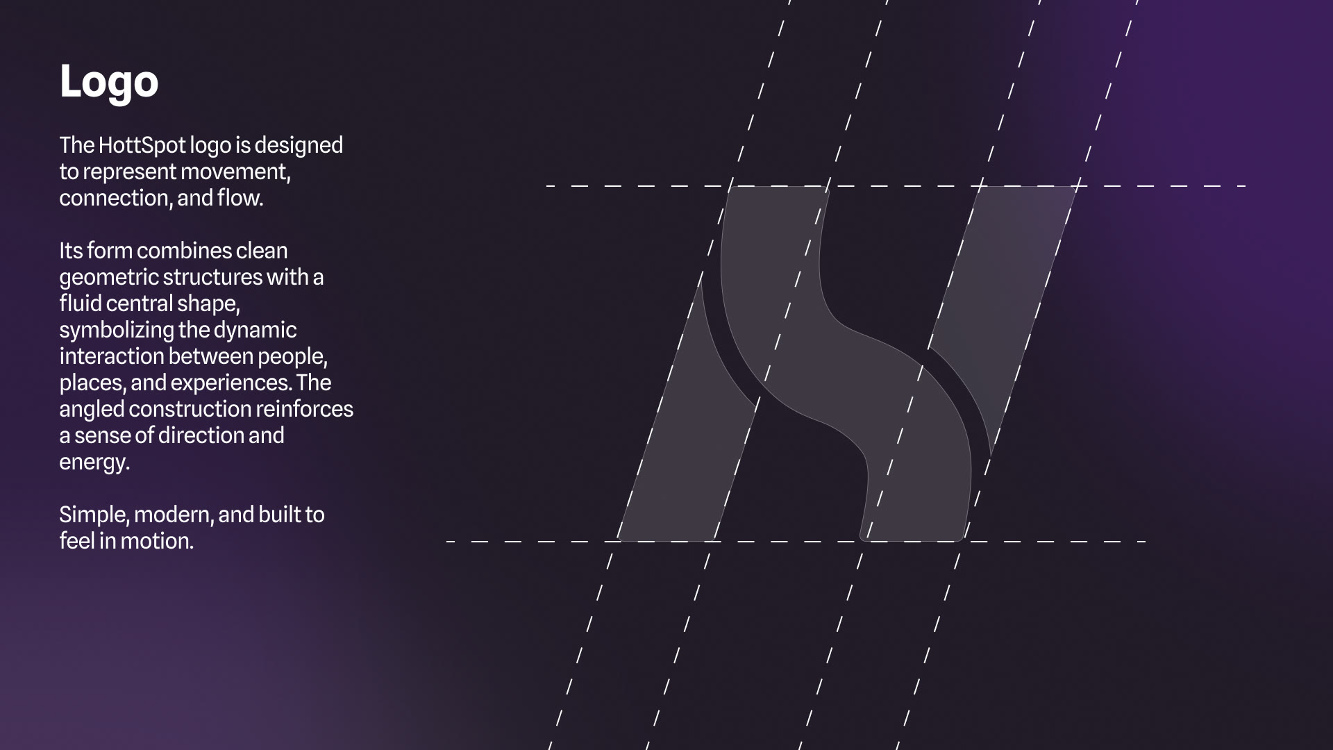
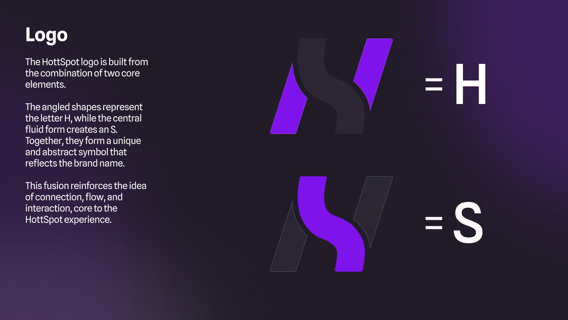
The symbol joins two elements: angled shapes that form an H and a fluid central form that creates an S. Together they make an abstract mark of the name, with clean geometry that carries a sense of direction, movement and connection between people, places and experiences.
Color
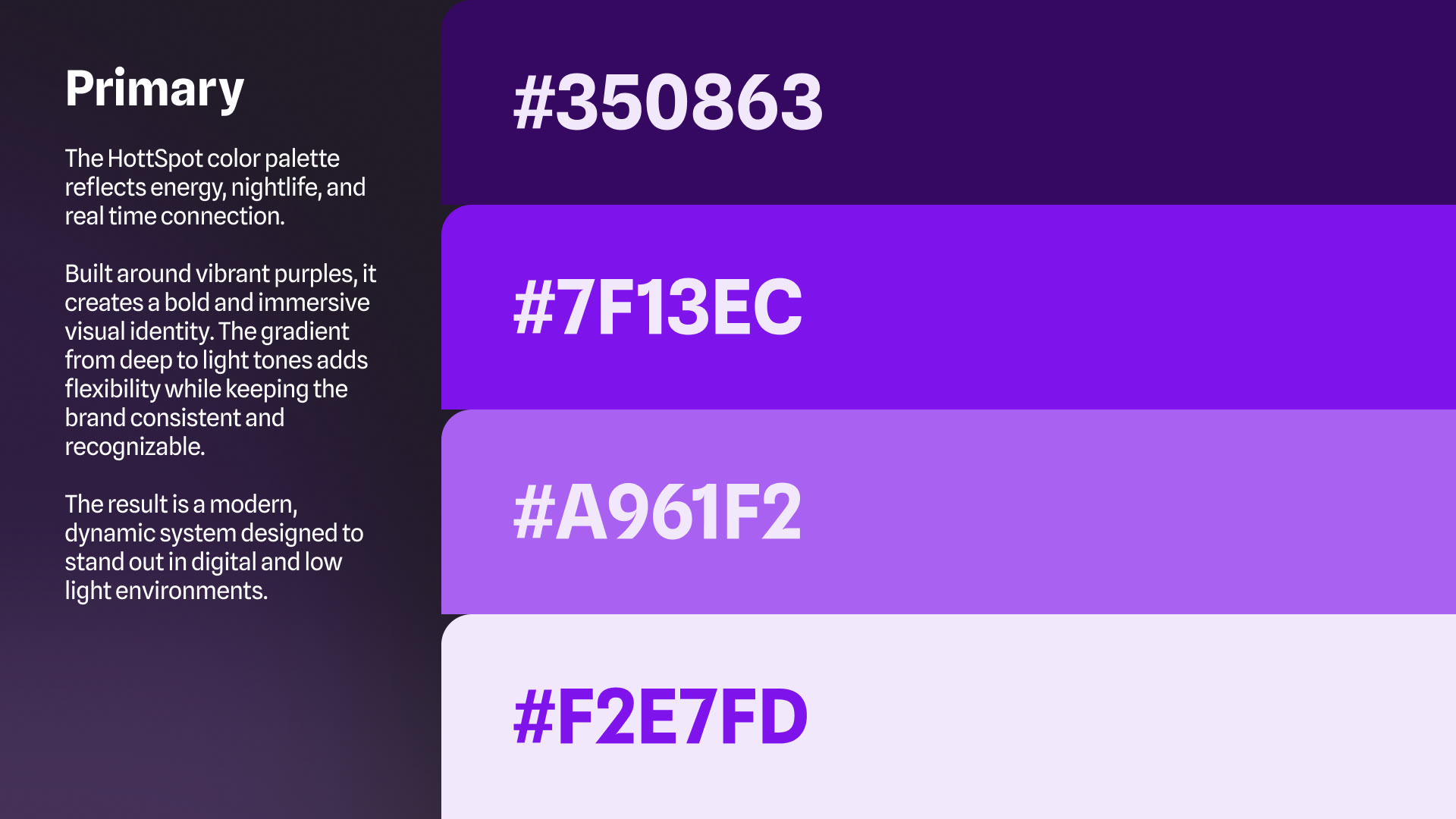
Vibrant purples lead the primary palette, from #350863 to #F2E7FD, while a neutral secondary palette handles backgrounds, text and interface. Gradients between light and dark tones add depth and a sense of movement, reflecting the nightlife the brand lives in.
Primary palette01 / 06